REMEMBER HOW GREAT the Obama campaign was four years ago? The slogans, the rising sun in the O, the typeface. The strong, confidant and bold letters, which seemed designed specifically for words like HOPE and OBAMA. Well, this year, Romney is trying to bite Obama’s typographic style.
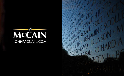
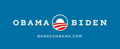
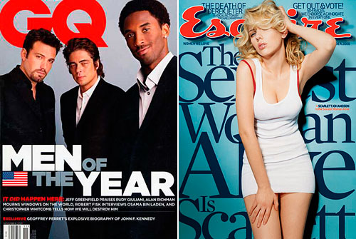
Campaign typography is crucial in positioning each candidate; the letterforms of a slogan carry as much of a message as the words themselves. It works on a subconscious level, connecting the words we’re reading now with emotions we’ve felt elsewhere at another time. It’s no accident that in 2008 the McCain campaign chose Optima, the same typeface that is used on The Vietnam Veterans Memorial (and a few war memorials since), a subtle reminder of McCain’s military record. Obama’s typeface, Gotham, was macho but less heroic; it was originally designed for GQ magazine. Now, the Romney campaign is using a typeface from another men’s magazine, taking Esquire’s Mercury Display and mixing it with Whitney, originally designed for The Whitney Museum. (Does this mean that Romney has some subtle leftish leanings pro the Arts and is aspiring to be like Jeremy Renner or, for that matter, Sarah Silverman, both of whom are on the cover of the August Esquire?)
There’s another coincidence about this year’s political typography. There are millions of fonts in the world designed by thousands of designers. While anyone seeing Helvetica the movie could be excused for thinking there’s only one typeface, there are centuries’ worth of good ones a campaign could choose from, like Caslon from 1720 or Trade Gothic from 1948. Still, both campaigns are using typefaces produced by the same design studio. The foundry (collective noun for type designers) is Hoefler & Frere-Jones, a New York City shop that has about 30 font families for sale at their site. H&F-J designed Gotham and created a new version for Obama’s 2012 campaign – giving it serifs. Serifs are the little feet common to traditional letterforms, originally a way for stone carvers to lead in to a carved stroke. H&F-J also designed Mercury and Whitney, the typefaces chosen by Romney.
Whilst Obama freely admits to borrowing some of Romney’s ideas, like Massachusetts healthcare reform, Romney wouldn’t dare admit to stealing anything from Barack. But the Massachusetts’ governor is clearly cribbing from Obama’s campaign typographic strategy.
In 2008, Tobias Frere-Jones said, “We see type as the clothes that words wear,” which makes him and Jonathan Hoefler tailors to both campaigns’ words, slogans, posters, ads… this year.
Vote Gotham Slab
It was Gotham that won the election in 2008 (at least for graphic designers). The solid, wide sans-serif is modern and its circular O is perfect for words such as OBAMA and HOPE. Originally designed for GQ magazine in 2000, HF&J says Gotham strikes “an honest tone that’s assertive but never imposing, friendly but never folksy, confident but never aloof.” Sounds familiar. Alice Rawsthorn wrote in the New York Times in 2008, “A glance at the lettering on the ‘Change’ banners at Obama’s rallies conveys a potent, if unspoken, combination of contemporary sophistication (a nod to his suits) with nostalgia for America’s past and a sense of duty.” Gotham was so successful that Ron Paul used it in a 2012 campaign video. At first glance you might think the type was animating Obama’s words, not Paul’s speech about Obama’s foreign policy failings in Iraq. Gotham is also so legible it’s found its way into government publications, including the 2010 Census.
Now the incumbent, Obama’s message is less about HOPE and more about PATIENCE. The Obama campaign asked Hoefler & Frere-Jones to create the slab-serif version of Gotham, as yet unavailable to the public – let’s just call it Gotham Slab for now. The little feet add solidity; it’s change standing its ground, persevering, unflappable.
Vote Mercury Display
This is Romney’s headline typeface, but H&FJ designed it for Esquire magazine in 1997. So, Obama vs. Romney is really GQ vs. Esquire ca. the late 90s and early naughts, which might indicate that both candidates subconsciously yearn to return to the boom days of yore. H&FJ describe Mercury as “spirited, subtle, ferocious,” “a contemporary serif that’s smart, quick, and articulate,” and “vibrant: tightly wound, yet quiet, using the tension between introverted and extroverted gestures.” Do we know a candidate like that? To really understand a typeface, you need to look at the architecture of its letterforms, and Mercury Display’s serifs are so solid and extreme that they go beyond any reference to chiseling stone.
Lurking under one of Romney’s beds in one of his oh-I-lost-count-of-them-homes, there’s probably a stack of old Esquires, where Mercury Display was once used in beautiful typographic collages. The larger than life words are stacked closely together, communicating a masculine, sexy style. Today, it’s his campaign typeface, but it’s all set at the same size on one line, a little more conservative, say.
Whitney – Let’s be clear
Romney’s secondary font is Whitney Semibold, which is more legible at smaller sizes than Mercury. It’s not surprising to see a political campaign mix typefaces, after all, they don’t want to alienate the floating sans-serif vote. Whitney was designed for the Whitney Museum, so clearly Romney doesn’t want to alienate the floating sans-serif-liberal-arts-institution vote either. H&FJ says, “Its compact forms and broad x-height” (to translate that’s how high the lowercase letters are in relation to the uppercase letters. The higher the x-height, the more legible the typeface) “use space efficiently, and its ample counters” (meaning the enclosed shapes in the middle of letters like “a” and “e”) “and open shapes make it clear under any circumstances.” So, Whitney is the “Let’s be clear…” and Mercury is the “Conservative Promise!” of Romney’s political stump speech.
From using the same foundry to choosing another men’s magazine’s typeface, the Romney campaign may be paying Obama the sincerest of compliments – imitation. Or perhaps Romney is trying subtly to sway swing voters who went for Obama in ’08. Whether this strategy was suggested by the campaign or by their agency makes no difference, because Romney adopted it. And come November, whether you vote for Gotham Serif or Mercury Display, you’ll be voting for Jonathan Hoefler and Tobias Frere-Jones. May the best typeface win.


I love a good typography essay and am still waiting for the Obama campaign to bust out Rotis semi-sans in a surprise sneak attack late October.
hello!,I love your writing so much! share we
keep up a correspondence more approximately your post on AOL?
I need an expert on this house to resolve my problem.
May be that’s you! Taking a look ahead to see you.