Over the next month we’re excerpting Tessa Laird’s astounding social history of the spectrum A Rainbow Reader. Last week in Part I we went from the personal to the political getting starting with birth and getting at the red heart of color.
ONE OF MY FAVORITE artworks exists only as a story for me – and now for you too. I never saw the performance Ramarama, and it’s highly unlikely that you did, unless you happened to be driving along a particular stretch of State Highway One, North Island, New Zealand, on a particular day in 1999. Neither have I seen its documentation Spaghetti Dharma, which played briefly at the Hamish McKay Gallery in Wellington, until the original VHS was sold to the New Zealand branch of Saatchi & Saatchi, never to be seen again. The performance artist was Daniel Malone, known for his risk-taking works, often built around puns, connections and coincidences, like drinking a bowl of punch and punching himself in the face, or reading aloud the dictionary’s sections for L, S and D while on acid. Now, Malone lives and works in Warsaw, but on this day in 1999, he donned orange construction-worker overalls, and walked along the median strip of SH1, from Bombay to Ramarama, a distance of nearly four miles. Filming his feet pounding the earth, brushing through wildflowers in his fluorescent overalls, Malone chanted the name of his destination over and over.
Ramarama in Māori means “to gleam” and is the name of a native shrub with glossy leaves. Rama can mean anything from torch to enlightenment, and Māori activist Tāme Iti of the famously resistant Tuhoe tribe chose this name for his group of indigenous militants, who became victims of so-called “anti-terror” raids in 2007, when 300 armed police descended on their small rural township and, among other things, held a school bus at gunpoint. But Rama is also a Hindu king, seventh avatar of Vishnu, the key figure in Diwali, festival of lights, and ramarama is a chant that Vaishnavites, including orange-clad Hare Krishnas, use to ward off evils and increase their spiritual cachet.
For Malone, ethnicity has always already been a Kabalistic code, made to be cracked and twisted so that the modular parts rearrange themselves like the colored crystals in a kaleidoscope – each turn of the hand produces a different reading. The coincidence of having a township south of Auckland named Bombay, residue of the British Empire, near a township named Ramarama by tangata whenua (first peoples) was too good for Malone to pass up. Not to mention his penchant for getting into workingmen’s clothes and above all, the lure of breaking the law for art. [1]
The sadhu is a Hindu religious mendicant who undertakes vast pilgrimages across the countryside, smeared in ashes, perhaps prostrating himself ritually, piercing or cutting himself, tying heavy objects to his penis, etc… Malone has tried all of these, at one time or another, in the name of performance art, demonstrating a certain disregard for pain and discomfort. But neither are Malone’s works simply acts of endurance – each gathers a network of conceptual threads together via the artist’s body, action, objects and language. Like most of Malone’s works, Ramarama is built on puns, those verbal quirks that both prove and refute intelligent design. Spaghetti Dharma augments these coincidences in nomenclature with a layer of the artist’s arcane meanderings, his brain its own spaghetti junction. Dharma is the life path we choose, and Malone chose State Highway One. Spaghetti in the cultural and especially filmic context stands for B-grade schlock (the sound generic spaghetti makes when it slides, soft and orange, out of the can). Malone’s spiritual quest is like a TV dinner for the soul, too goofball to be truly meaningful. But at the same time, danger, illegality and duration make it more than just a bad pun. Walking away from Empire, Malone walked towards the light, Ramarama, in Enlightenment orange.

Orange Sadhu by Flickr user P, published under Creative Commons.
~
Spaghetti Dharma marries two opposing sides of the color orange. The first is Eastern spirituality; orange-robed Buddhist monks throughout South East Asia; the orange attire of Hare Krishnas, followers of Rajneesh, or of Ananda Marga meditation, not to mention the orange sadhus wear when they’re not “sky-clad” (naked). And the strings of orange marigolds threaded into elaborate chandeliers dangling blindingly in the Hindu temples of India, or worn as garlands for the living and the dead. I saw a sacred white cow eating a marigold garland gleaned from a pile of trash on the burning ghats of Varanasi. Perhaps it had been the last worldly decoration of a corpse. The cow ate the orange string the way a human sucks up a long strand of spaghetti (Spaghetti Karma?) staining the chin and producing a slurping sound.
The flipside of the color orange is its co-option by global construction companies and in particular, road construction and traffic control. This is a very different kind of orange. There is less yellow in it; it’s somehow simultaneously brighter and colder. I hate construction. Perhaps this is an odd statement for an artist, for aren’t we all involved in this mania for making anew? Isn’t this piece of writing just another edifice, like those fashioned of terracotta bricks, only, instead of baked slabs of clay, word is placed upon word? And yet I find myself heartsick every time I walk past a construction site, convinced that whatever is going up will be uglier than what just came down.
Walter Benjamin cataloged a range of reactions to the “Haussmanization” of Paris, the medieval city’s rational reorganization in the latter half of the nineteenth century. While sanitation improved, Paris became a city of regulations and bylaws, and of the famous wide boulevards which favored military parades over revolutionary barricades. Benjamin quotes Edouard Fournier who quips, “For some time now, there have been efforts to discover where this word boulevard could have come from. As for me, I am finally satisfied as to the etymology: it is merely a variant of the word bouleversement <commotion, upheaval>.”[2] I imagine Haussman’s Paris in 1853 awash with orange traffic cones and road dividers, to the horror of any self-respecting flâneur.
In the US, roadside construction-sites bear the legend: END CONSTRUCTION when you reach the site’s conclusion. I like to read the signs in the imperative rather than the declarative. For what is “construction” other than destruction dressed up in orange plastic?

Though there’s never really any end in sight.
~
Construction and destruction are opposite sides of the same coin – the dual nature of God or whatever name you have for the universe. This is particularly well exemplified by Shiva in his Nataraja aspect – the cosmic dancer. Poised within a flaming circle, dreadlocks flying, his foot pounding the dwarf of ignorance into submission, Shiva sets the wheels of creation into motion – but he does this by destroying the weary universe in this tandava, or dance of death.
Nietzsche might be describing Shiva when he talks of “an entirely reckless and amoral artist-god who wants to experience, whether he is building or destroying, in the good and in the bad, his own joy and glory – one who, creating worlds, frees himself from the distress of fullness and overfullness and from the affliction of the contradictions compressed in his soul.”[3] Or is it Le Corbusier the architect-god who is invoked, when, in his misapprehension of Greek ruins, he liberates them from all their intended color and detail, their Bollywood-style bustle and overfullness? I find myself, when thinking about flaming orange cones girding colorless constructions, wanting to draw a line in the sand between the organic joy of the Austrian artist, eternal hippie and would-be architect Friedensreich Hundertwasser, and the rigid monotonies of Le Corbusier and his legacy. But perhaps it is lines themselves that are the problem? Yves Klein, the painter, conceptual artist and great champion of color who patented his own shade of blue, thought lines were a problem, writing in his 1954 manifesto “The War” that line is jealous of color, and that line introduces the unforgivable sin of figuration into painting, of writing and the tedious impulse to explain. But Klein feeds off this duality, declaring passionately: “War is necessary, and is necessarily followed by peace, and peace by war again, and war again by peace – Duality – Duel – Contrast – Opposition – Progression and Evolution…”[4] So Klein is both colorist and warmonger. Not such an unusual position, as we shall see.
~
I started reading Thomas Pynchon’s Gravity’s Rainbow because I thought it would be about color. I thought it would be about Newton, the guy who invented Gravity and the Rainbow (and, so I hear, the cat door). I thought maybe it would be about the dull, grey, seriousness of gravity versus the arching colored levity of the rainbow. The apple and the fall from grace. (Perhaps grace is the zero-gravity weightlessness we experience in the womb, after death, or in deep space?) In Gravity’s Rainbow, the ultimate deceit of physics is not only that what goes up is doomed to come down, but that the rocket bombs that trace a gruesome arc in the sky – undoing the rainbow covenant as they go – travel faster than the speed of sound. Ergo, if you hear them, you’re already dead.
Pynchon viewed U-Boats and D-Day through the kaleidoscopic lens of the late 60s and early 70s when the book was written. It’s as though WWII was taking place NOW (then), when the book was penned, in a free-love, drug-fuelled haze. And it’s clear that the psychedelic imagination of the 1960s was a by-product of that war, dreamed up by adults reclaiming the childhood that had been invaded by Churchill and Nazis (“Nasties” was John Lennon’s coinage). Years later, when Lennon and others were taking LSD, the world they evoked was strangely militaristic: Sgt. Pepper’s featured The Beatles in the costumes of an ancient military band (George, channeling India, in the flaming orange). Brass bands, orchestras, echoes of old-time music halls, Wurlitzers, organ-grinders, all of this yesteryear sound is gathered up and re-presented as if seen through the refractive lens of LSD, a literal “trip” down memory (Penny) lane.[5]

Somehow in rainbow colored satin, the Beatles military regalia looks less war-mongering and more LSD-inspiring.
Gravity’s Rainbow is full of sex and drugs but substitutes rock and roll with a plethora of music hall numbers and strange, goofy war tunes, songs that fan out into the mise-en-scene like musical set-pieces from the big screen. The musical is an incredibly psychedelic format – think of Busby Berkley’s moving mandalas of chorus-girl limbs – exactly the kind of fractal vision LSD induces. The musical is the perfect vehicle for surrealism – look at Bollywood’s dance sequences in which all logic, sequence and plot is suspended for an outrageous interlude of costume changes, scenic backdrops, manic multitudes of gyrating males, manic multitudes of gyrating females and unbridled use of color. In Indian cinemas, light bulbs around the screen start flashing during hit song sequences. Pynchon writes of the televisual color jarring that occurs in an on-screen musical. “The images often changing scale so quickly, so unpredictably that you’re apt now and then to get a bit of lime-green in with your rose, as they say.”[6]
But back to war (and peace). Jimi Hendrix wore military jackets with great aplomb. Interesting that military jackets became so fashionable among the flower children of the late 1960s. The animated film The Yellow Submarine features a psychedelic parable of war, where Lennon’s “Nasties” have morphed into “Blue Meanies,” clownish villains who share their name with a species of magic mushroom. The tropes of wars gone by were recycled by rock, pop and fashion for battles fought exclusively in the mind or in the social arena. Jonathan Harris writes in Summer of Love that “…a kind of ‘bending’ or Situationist detourning takes place in the pastiche of military garb. The Beatles, along with many others in 1967, wished to remake the meaning of certain cultural and social codes, [they] wanted to associate these uniforms with music, play, lightness, ‘peace’ and ‘love.’”[7]
The surge of interest in flamboyant male attire in the late 60s was dubbed the Peacock Revolution, and perhaps it’s not entirely irrelevant that in Hindu mythology womanizing Krishna is associated with peacocks and the God of War, too. Kartikeya, the son of Shiva the destroyer, leads an army of gods into cosmic battle on the back of his divine peacock. In Māori mythology, Uenuku is not only the god of the iridescent shimmering colors of the rainbow, but also a god of war. Iris, messenger of the gods, appears in the Iliad as a “harbinger of war and turbulence.”[8] Iris was so frequently associated with malignant portent, that an etymological relationship is posited between iris and ire.[9] And, on the other side of the world, the excavation of a Viking’s grave revealed a small bundle of peacock plumes, “as fresh as when put there,” nestled amongst his amour and weapons,[10] for shimmering raiment used to be the attire of warriors before we felt the need to camouflage our intentions.[11]
Albert Hofmann accidentally synthesized LSD in 1938, although it wasn’t until 1943 that he determinedly ingested the substance. This took place in the Swiss Sandoz laboratory, which, incidentally, before branching out into pharmaceuticals, had specialized in dyestuffs: drugs and color, forever intertwined.[12] So, in the heart of WWII, an invention that would explode the minds of the next generation was born, the rainbow-colored twin of the sinister invention that marked the close of the war, the atom bomb, culture’s new “heart of darkness.” Timothy Leary, paraphrasing Owsley, the notorious Bay Area acid “cook,” suggests that LSD, the “spiritual equivalent of the hydrogen bomb”[13] only became psychedelic after the release of atomic energy in 1943.
The atomic fission in December 1942 changed the whole system of energy in this solar system. The higher intelligence decides to make a few simple changes in the electronic structure of some atoms, and zap! We have LSD, an incredibly powerful substance that is the exact antidote to atomic energy. People take LSD, and flash! They get the message and start putting things back in harmony with the great design. Stop war! Wear flowers! Conservation! Turning on people to LSD is the precise and only way to keep war from blowing up the whole system.[14]
~
Gravity’s Rainbow seems covertly about Vietnam, while ostensibly about a war that’s done and dusted, dusted like the verdant green of tropical Vietnam getting burned up with Agent Orange, a herbicide and defoliant used by the US military to “flush out” Vietcong from their native jungles. Pynchon’s panoply of rockets and bombs was envisaged against the backdrop of US Military hawks like General Curtis LeMay calling to bomb Hanoi “back to the Stone Age.”
Incidentally, Agent Orange was only one color in a range of “Rainbow Herbicides,” but it was by far the most widely used.[15] As anthropologist Michael Taussig puts it in What Color is the Sacred?, “Not only kids, primitives, and southern women love bright colors – war does too.”[16] Conversely, bomber crews in WWII liked to include at least one color-blind member; they were impervious to camouflage.[17]
~
Orange in the late 60s and early 70s was psychedelic, but it was also forever connected to Agent Orange and burning napalm. Alexander Theroux wrote about orange and associates the color derogatorily with plastic food, bad furnishing, awful clothes… Orange is kitsch, it’s the hairdos of 1950s starlets and the color of hotdogs at a baseball game. Orange is cheeseball, nostalgic, Hollywood through and through, and yet, it has another, terrible aspect. Theroux remembers “that unforgettable photograph taken on June 11, 1963, of the suicidal but selflessly propitiatory Vietnamese Buddhist monk, Thich Quang Duc, protesting American involvement – he was gazing into a decade of horror – sitting full lotus in a swirl of flames on a hot summer street in Saigon, back erect, shaved head held high, while orange flames, blazing up, consumed him in his orange robes as he stared transfixed into the middle distance with blackened hands raised like a statue in dying benediction. Orange in its high saturation is a color not easy to forget.”[18] Orange is also the color of Kool Aid, the generic orange “bug juice” cordial that was laced with potassium cyanide and doled out to the members of the Reverend Jim Jones’s cult in Guyana in 1978.[19] Drug and poison, Kool Aid was also the medium of choice for lacing with acid in the 1960s, by Ken Kesey and his Merry Pranksters.

Thich Quang Duc, photographedby Malcolm Browne in Saigon, 1963.
A particular brand of orange, redolent of the drug culture of the late 60s and early 70s is peppered throughout Gravity’s Rainbow. Osbie Feel, whose very name sounds like a psychedelic pop band, harvests “shiny red-orange” Amanita muscaria toadstools from a roof garden. “He is carefully scraping out the inside of each persimmon-colored mushroom cup and shredding the rest. Dispossessed elves run around up on the roof, gibbering. He now has a growing heap of orange-gray fungus, which he proceeds to add in fistfuls to a pot of steaming water.”[20] At the door watching this procedure is Katje, the Dutch girl, who plays a hallucinogenic role in the narrative, using colored costume changes to seduce the protagonist, Slothrop,[21] a reminder of the Rolling Stones’ 1967 hit song, “She’s a Rainbow,” which features the line “she comes in colors.”[22]
The psychedelic 60s are all over Pynchon’s 40s, perhaps because, thanks to Hofmann at Sandoz, psychedelia was already extant. The 40s movie star Cary Grant, who regularly took LSD, is mentioned frequently in Gravity’s Rainbow. Characters’ names are druggie in-jokes – the Russian Tchitcherine is reminiscent of the German psychedelic band Tangerine Dream, not to mention the Tangerine trees and marmalade skies of the Beatles’ “Lucy in the Sky with Diamonds” (interpreted as code for LSD, despite John’s protestations). Tchitcherine’s lover is Geli (pronounced Gaily) Tripping! Saure (German for Acid) Bummer is essentially a walking bad trip. There’s even a town on the German/Polish border called Bad Karma. A song called The Doper’s Dream is 60s through and through.[23]
~
The first cover for Gravity’s Rainbow, published by New York’s Viking Press in 1973 was of a skyline of houses in front of a lurid orange sunset, in which an ominous spiral of white looms. A later Penguin paperback in 1987 featured a photograph of a large orange setting sun. Funnily enough, though, Gravity’s Rainbow has never had the classic orange cover of Penguin fiction. That design convention in itself speaks volumes about the cultural meaning of orange. Like the alert orange of traffic cones, the constant change of destruction/construction, Penguin’s orange books proclaimed themselves to be modern, in the vanguard, at the leading edge of literary style. Four years after Penguin started publishing, WWII was declared, and the publishers considered it a “happy accident” that a battledress pocket could accommodate an orange Penguin tome “as if made for it.”[24] That this bold, assertive, modern package has now become “classic,” a symbol of the restraint and simplicity of times gone by, just goes to show how much times have changed.
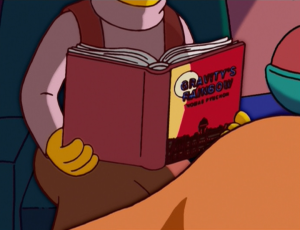
The first edition of Gravity’s Rainbow even makes a cameo on The Simpsons.
~
Just as Pynchon and other artists of the 1960s re-evaluated, indeed, reinvented their relationship to the era of their childhoods, so I look back upon the late 1960s and early 70s as the era which informs my political beliefs, spiritual inclinations and aesthetic sensibilities. And, in the same way Pynchon used WWII to covertly talk about Vietnam, so artists have looked back to Vietnam era protests when making work critical of the US invasion of Iraq in 2003. Known for being one of the more politically engaged artists on the contemporary American scene, Sam Durant displayed light boxes at that year’s Venice Biennale with slogans lifted from protest marches of the 1960s. At the time I thought this was a cop-out – why not address the issue in front of our noses? Why couch contemporary political dissent in nostalgic rhetoric? Yet, I too find myself drawn to the imagery and styles of this same, hopelessly over-romanticized era, because from the vantage point of today’s cynical, confused disengagement, the 60s glow with an aura of freshness, in which the intensity of ideas seems palpable.
Although the 60s have passed, the radicalism of that era exists in the present tense as part of a historical continuum that was always already there and will never be over. I am ready to reappraise Durant’s relationship with the past, along with my own, as a kind of ‘nostalgia with intent,’ that is, a relationship with the past that transcends mere fascination with style and surface. Walter Benjamin noted that “fashion has a flair for the topical, no matter where it stirs in the thickets of long ago; it is a tiger’s leap into the past.”[25] But Benjamin qualifies this stripy stirring by saying fashion takes place in an arena where the ruling class gives the commands. However, “the same leap in the open air of history is the dialectical one, which is how Marx understood the revolution.”[26] If Durant wasn’t exactly leaping in the open air of history at the Venice Biennale, he was at least taking a surreptitious tiger’s prowl: attempting to reawaken some of the political urgency of the 60s by using style as a visual mnemonic for the political, social and theoretical imperatives of the time.
When reading Benjamin’s “Theses on the Philosophy of History,” I found my thoughts wandering back to the wandering Malone, who could at least argue that his orange-clad, padded prowl from Bombay to Ramarama was literally in the ‘open air.’ Walking North on the Southern Motorway, he is somewhat akin to Benjamin’s historical materialist, who “regards it as his task to brush history against the grain.”[27]
Sam Durant tried to reverse the flow of history with Entropy in Reverse, which he exhibited at the Govett-Brewster, New Plymouth, New Zealand, in 2003. On a double screen, Durant projected footage of the Rolling Stones concert at Altamont in 1969. It was that disastrous night when the young black man Meredith Hunter was murdered by Hell’s Angels, the whole sorry affair becoming emblematic of the end of the 60s utopian fantasy. Durant had the film playing backwards, to reverse the demise of these ideals, to re-inscribe the importance of everything that the 60s stood for. I was unconvinced by the execution of Durant’s polemic, which also featured a strange oozing white sculpture and sat awkwardly in the sterile white gallery space, though I still appreciated the sentiments. Durant’s paean to the 60s was intellectual, not experiential. There were no cushions, no light show, no incense. It was far from any kind of Summer of Love idyll, but now that my memory of the work’s ungainly physical presence has faded like an old photograph, I find myself more and more a fan of Entropy in Reverse. Like Malone’s Spaghetti Dharma, or the 1960s themselves, perhaps you didn’t even have to be there to get it.
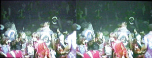
Sam Durant’s Entropy, showing the Rolling Stone’s disastrous concert at Altamont in reverse.
[1] Malone once performed in the fatigues bleus he brought back from Paris in his youthful homage to Baudelaire and Benjamin, Les Fleurs du Malone, in Albert Park, Auckland, circa 1993, while examples of lawlessness in Malone’s practice are far too numerous to catalog here.
[2] Edouard Fournier, Chroniques et legendes des rues de Paris (Paris, 1864), 16, quoted in Benjamin, Walter, The Arcades Project, translated by Howard Eiland and Kevin McLaughlin (Cambridge, Mass.: Belknap Press) 1999, 140.
[3] Nietzsche, Friedrich, The Birth of Tragedy (New York: Random House), 1967, 22.
[4] In Colour After Klein: Re-thinking Colour in Modern and Contemporary Art, edited by Jane Alison (London: Barbican Art Gallery: Black Dog Publishing), 2005, 160.
[5] “The double A-side ‘Strawberry Fields Forever’ / ‘Penny Lane’ recalled the Liverpool of Lennon and McCartney’s youth – a process of recall assisted by LSD which meant the songs provided ‘hallucinogenic ventures into the mental interior.’” Murden, Jon, “Psychedelic Liverpool?” in Summer of Love: Psychedelic Art, Social Crisis and Counterculture in the 1960s, edited by Christoph Grunenberg and Jonathan Harris (Liverpool: Liverpool University Press: Tate Liverpool), 2005, 270.
[6] Pynchon, Thomas, Gravity’s Rainbow (New York: Penguin Books), 2000, 13.
[7] Harris, Jonathan, “Abstraction and Empathy: Psychedelic Distortion and the Meanings of the 1960s,” in Grunenberg and Harris, 12. These sentiments are further echoed by Cally Blackman in her essay “Clothing the Cosmic Counterculture: Fashion and Psychedelia” which looks at psychedelic fashion. “The cover of Sgt. Pepper by Pop-artist Peter Blake featured the Fab Four dressed in camp, brightly coloured satin uniforms, perhaps an ironic comment on the continuing Vietnam War. Military uniforms had long been included in the fashionable male wardrobe. Sold by shops such as I Was Lord Kitchener’s Valet, initially in Portobello Road, then with branches in Soho and Chelsea, they perfectly combined anti-Establishment sentiments with the element of dressing up (…) Beloved by the music glitterati, a frogged, fur-trimmed military jacket was habitually worn by Jimi Hendrix, whose eclectic, voodoo-gypsy style mirrored that of his fellow-American Janis Joplin, while Mick Jagger wore a jacket from the Grenadier Guards.” Ibid, 217.
[8] Graham, F. Lanier, The Rainbow Book (Berkeley, London: The Fine Arts Museums of San Francisco in association with
Shambhala), 1975, 37.
[9] Ibid, 39.
[10] Jackson, Christine E, Peacock (London: Reaktion Books), 2006, 99. This association of war or revolution with fashionable attire perhaps goes as far back as the Cambrian Explosion, which, scientist Andrew Parker explains, was due to the arrival of vision on the evolutionary scene. In this dog eat dog, “or rather, trilobite eat trilobite” world, “armaments were ornaments.” Parker, Andrew, In the Blink of an Eye: How Vision Sparked the Big Bang of Evolution (New York: Perseus), 2003, 277.
[11] For an enlargement of these ideas and many more, see: Taussig, Michael, “Zoology, Magic, and Surrealism in the War on Terror,” Critical Inquiry, Vol. 34, No. 2, (Winter 2008), 98-116.
[12] This slippage between colours and drugs is well documented. In the seventeenth and eighteenth centuries pigments “tended to be categorised either with imported spices or with drugs (since some artists’ materials also had pharmaceutical uses), and so they were sold by grocers who dealt also in foods and medications – recalling how in ancient Greece pigments were called pharmakon.” Philip Ball, Bright Earth: The Invention of Colour (Hawthorn, Australia: Penguin), 2002, 201.
[13] Leary, Timothy, The Politics of Ecstasy (Suffolk: Paladin), 1970, 99.
[14] Ibid, 227.
[15] Indeed, there was also Agent Purple, Agent Pink, Agent Green, Agent Blue, and Agent White, which sounds to
contemporary ears like a farcical film by Quentin Tarrantino.
[16] Taussig, Michael, What Colour Is the Sacred? (Chicago: University of Chicago Press), 2009, 4.
[17] Dawkins, Richard, Unweaving the Rainbow: Science, Delusion and the Appetite for Wonder (Boston: Houghton Miflin), 1998, 58.
[18] Theroux, Alexander, The Secondary Colours: Three Essays (New York: Henry Holt & Co.), 1996, 27-28.
[19] Though apparently, Jim Jones chose grape-flavoured Kool Aid, an electrical, ecclesiastical shade of purple more fitting for a mass suicide. Ibid, 158-159.
[20] Pynchon, 94.
[21] Hayles, N. Katherine, and Mary B. Eiser, “Colouring Gravity’s Rainbow,” Pynchon Notes 16 (1985), 16.
[22] The Stones stole this line from the band Love, who had a song called “She Comes in Colours” in 1966. In the same year, Playboy magazine used this title for their Timothy Leary interview. Leary, 99.
[23] Pynchon, 375.
[24] Baines, Phil, Penguin by Design: A Cover Story 1935-2005 (London: Penguin Books), 2005, 15.
[25] Benjamin, Walter, “Theses on the Philosophy of History,” in Illuminations, edited by Hannah Arendt (London: Jonathan Cape), 1970, 263.
[26] Ibid.
[27] Ibid, 259.