MUSEUMS ARE GENERALLY white: white walls, white marble and white visitors…. Not the Detroit Institute of Arts. Yes, the marble is creamy, but the visitors are diverse. The day I was there recently there were kids and families of all stripes. The museum was about as multiracial as it gets. A docent (retired, white) explained in his flat Midwestern accent to an African-American family (two young girls and their mother) about his favorite painting in the American collection. It was by Robert Duncanson, the son of freed slaves. In the cafeteria an Asian kid bugged his dad for cake; meanwhile a British couple complimented the cashier on “her collection and her museum.” The pride in her voice as she responded was impressive. Perhaps doubly so in the Kevyn-Orr-era of Bankruptcy Detroit when the museum’s future is uncertain.
The DIA’s collection is encyclopedic, like a mini Met. It’s impossible to put a price on the experiences of growing up with a museum. (I have fond memories of school trips to the National Gallery of Art and seeing exhibits like “Rodin Rediscovered.” The French sculptor’s great hellish gates haunted me.). How do you hold that up to the some $9bn in unfunded pension costs that make up half of Detroit’s current debt? What do you say to the pensioners? Orr has called in lists of assets from all city institutions – not just DIA – and this week Christie’s was hired to assess the collection. Its value is somewhere north of $2bn. Meanwhile, the city of Detroit no longer gives money to cover DIA’s operations. It can’t afford to. Last summer the surrounding counties voted overwhelmingly for a tax hike just to bankroll the museum. If that doesn’t speak to its importance, what does? The entrance fee is cheap, a mere $8 compared to the $25 to get into MoMA and the Met (it’s the latter’s “suggested donation.”). And, DIA’s collection is hung generously with engaging games and places for kids to draw, so how do you choose what will stay or go, or for that matter the museum’s fate and future? My list is below.
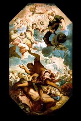
1. Tintoretto – The Dream of Men
The title alone might give it away—evanescence, loss and hubris. No. The painting, a roof mural, is one of the two most valuable pieces in DIA’s collection. The composition is bold and showy with a fugue of lights and darks overhead, but the very fact that it’s on the ceiling means you know the painting was somewhere else originally. Seeing a piece that was designed for an architecturally specific place gives away the lie of a museum, this idea that a painting will rest here in perpetuity. That’s the hubris – the one of museums, of the very notion of a museum. We all know they’re a cultural construct, that the work shown in them has little connection to how it was originally shown. So, here’s the rub, with a piece affixed to a roof, somehow that truth is much, much clearer. With paintings on a wall you can pretend they were always meant for a gallery-like space, for walls much like the ones you’re looking at. And, museums are based on this idea of permanence, that they will be here forever and ever. (Though the museum is an early nineteenth century innovation which slowly migrated west to New York and then to Detroit). All of them have the same visual language, as if museums are a group of interchangeable signs for power and permanence marked by grand steps and columns and courtyards, preserving that solidity and foreverness with stolidity and rock and marble. Here, though, incredibly one of DIA’s most valuable painting gives lie to all that simply by how it’s hung. See the Tintoretto on the ceiling, and you know it was ripped from another ceiling.
Then, there’s the subject: The Dream of Men. You see no saints – not God or Jesus, no Mary, no baby, so you know this came from neither church nor chapel. It was from someone’s house, in fact someone’s bedroom. And, you have to give Tintoretto this (or rather his patrons), most typical bedroom subjects would have been Leda and the Swan (a rape), the Rape of the Sabines (mass rape) or the Rape of Europa, and you get the idea. (The Rape of the Sabines, a version of which hangs a gallery away, had both sex, making it risqué, and a founding myth of Rome, making it about power). Look in the mirror placed in the gallery below for a better view of the scene, and the legend tells us Saturn is holding an hourglass. His son Opportunity stands on a glass sphere and reaches to the gods of wealth, love and fame. The message being: “The ambitious must seize opportunity because time is fleeting.” Somehow that seems apt to Detroit’s predicament. The painting is worth somewhere around $100 million, less than the Matisse that’s estimated at $150 million. I’d keep the Tintoretto over just about any Matisse any day.
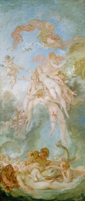
2. Fragonard or Boucher?
Both painted frilly scenes of erotic sweet nothings for the court of Versailles just prior to the French Revolution. At DIA you have Fragonard’s The Goddess Minerva – a round portrait bust in a lozenge-shaped frame. She, flowery and pink-cheeked. (Pink was a popular color for the light and puffy paintings of the Ancien Régime). But, all isn’t well here. Her eyes are cast to her side and her fist clenched. The goddess of war and wisdom is wary and worried, her robes roiled in the breeze. Her hat with a plume seems to be mirrored in the frame as if to draw attention up and maybe away from her fear. She has reason to be afraid. The year she was painted, 1772, trouble was afoot in France, with revolution fomenting in the British colonies in North America.
Then there is Boucher’s Birth of Venus, painted nearly a decade earlier. The canvas looks like a fever dream of sex, a sketchy pink cartoon of lolling bodies. They recline, waiting, some fleshy male fantasy. The only guy is largely hidden, obscured by the lady in repose across the foreground. The sketchiness Boucher’s brushstrokes here give the canvas a hasty feel as bodies lift on eggshell blue clouds.
If I had to choose, Boucher definitely would go. He and Fragonard both worked in the court at Versailles and both recorded scenes tinged with erotic frisson for courtiers. This at a time when most others in France couldn’t even afford bread. Boucher painted Mme. du Pompadour naked as Venus, and Fragonard treated her as a metaphor for sexual abandon in The Swing. (The painting suggested you could see up her skirts). This was an age where even bare toes were racy. And, looking at Boucher’s Birth of Venus, there’s no sense of an outside world, no poverty, breadlines, crippling taxes imposed to keep the rich in silk and lace. I can’t help but think the present day is peeking in at the edges of Minerva, with her anxious look. Maybe that interpretation is hindsight. The French Revolution took most of Fragonard and Boucher’s patrons to the guillotine.
Fragonard had worked originally in Boucher’s atelier as an apprentice. So adept was he at mimicking his master’s style, Fragonard was put in charge of the copies and basically made Boucher’s stand-in. Perhaps that was his downfall. Come the revolution, Fragonard was forgotten. He fell out of favor and into poverty. He was ignored by the first modern art history survey in 1873, while Boucher was lionized as, “One of those men who represent the taste of a century, who express, personify and embody it.” I still feel for Fragonard.
3. Adam and Eve by Lucas Cranach the Elder
In Wolf Hall Hillary Mantel channels a conversation between Thomas Cromwell and Hans Holbein about Cranach, where the two diss him. “–And Cranach makes everybody look like a pig” the fictional version of Holbein says. “True,” Cromwell responds, “even those silvery nudes he paints have sweet pig faces and laborers’ feet and grizzly ears…”
I can attest to the laborers’ feet. Just look at Eve’s toes. They’re weird. What Mantel didn’t say, what Cromwell didn’t speak (and how could he?) was that Adam here looks like a Brooklyn hipster, the kind who dresses like a logger but never cuts wood. He has a scraggily beard and weak, wasted muscles. His mouth is open and eager, nervous as he looks at Eve, and she is bored. She gazes off with disdain. Together the two of them hold the apple, though it looks like she could care less. Jaded, she’s saying, I’ve got more going on than you, buster. I’ve got the knowledge. He holds the tree branch that covers his penis and her pudenda, while behind him a buck (a prize 12-pointer) appears dead. Down the tree of knowledge the serpent slithers, its mouth parted too. The snake is as yet unaware it’s been sentenced to crawl on the ground as the lowest of animals. (Poor snakes). But, this is so much better than John Currin’s recent (hipster) versions at a Cranach-y style starring his wife. I’ll take the 16th century over the 21st and actual Brooklyn hipsters any day.

Adam and Eve, Lucas Cranach the Elder, 1528, oil on wood panel (transferred), Detroit Institute of Arts.
4. Hans Holbein, Portrait of a Woman
In the novel, the conversation about Cranach continues with Holbein saying, “But if I paint Henry, I must flatter I suppose…” Something to consider as you look at his “Portrait of a Woman.” She is dour and doughy with a big nose and harelip. What’s amazing is how unlovely she is. Her style is plain: dark clothes, white wimple of a head covering to show her modest middle-class nature. No wonder Holbein decided to go to England where he could paint kings and royalty and their advisors. At the time the British court had few skilled painters, and the gentlewomen of Holbein’s country had nothing on the mink, ermine and jewels of Henry and his circle. Despite how Cromwell and Holbein joked (in the novel at least), the paintings show us how close he and Cranach were. And, what is amazing is that Holbein’s woman looks real, like an everyday person. Like perhaps one of the gallery’s own docents (minus the head covering). I think DIA should keep both of them.

A Woman, Hans Holbein the Younger, 1532/1534, tempera and oil on oak panel, Detroit Institute of Arts.
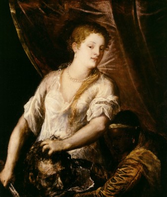
5. Titian or Gentileschi?
Who, you say, when reading the latter’s name. Artemisia Gentileschi? See, this the fate of women artists condemned for centuries to be a “who,” an afterthought. Here though are two versions of Judith and Holofernes, and in both Holofernes is represented by his sliced-off head. The story is that Judith used her guile to seduce and kill Holofernes and save her people. Both feature her and her maid. Titian’s Judith is bathed in his gorgeous, golden, glowing light. She is beautiful, too beautiful given what she’s just done. She clutches the head but somehow there’s a division in the painting as if the top and bottom are two different compositions. Her head is tilted to the side, more coquette than killer, as if she has nothing to do with the head in her hand. Meanwhile her black slave kneels at her feet to bag up Holofernes. Titian’s Judith doesn’t look capable of a beheading. To cut off a head with a sword is hard work.
Then there’s the Gentileschi. I stopped dead with a gasp upon seeing it. It’s one of the classics of feminist art history – a history in part made of lists of women who had they been better educated or allowed to study the nude or given access to what men had, could have been called great. The exception? Artemisia Gentileschi. She hangs here across from her father, and is better than him by half. Still she was forgotten for centuries because she was a woman. Her version of Judith: Gripping. Powerful. The painting is dramatic, the light blocked by Judith’s outstretched palm telling some unseen intruder to stop. The women are in danger. The maid (no black slave here) rushes to collect the head, looking up at the intruder, while the sword hangs over her neck.
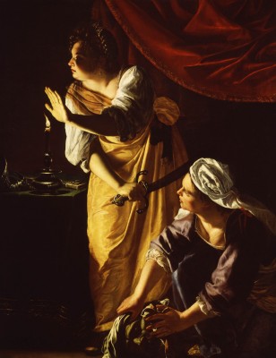
Judith and Her Maidservant with the Head of Holofernes, Artemisia Gentileschi, ca. 1625, oil on canvas. Detroit Institute of Arts
It’s easy to read the subject as an allegory for Gentileschi herself taking power and beheading – even castrating. Using personal facts in interpreting an artist’s work is a fool’s game, even more so for one alive 400 years ago, but it’s impossible not to bring her biography in here. She was raped when young by a friend of her father’s. I can’t imagine a reason for her father to lie about that when such an accusation would ruin his daughter’s reputation. The friend blamed a younger man, and in court Artemisia was tortured with thumb screws to get her to tell the truth. She apparently protested that the screws were a poor substitute for the wedding band her rapist had promised. Her dad’s friend was found guilty but went off without damage to his reputation, while hers was ruined. She went on to paint Judith three times, a repetition that suggests the subject had some traction. She also never painted a Madonna, the virgin, once. I say keep the Gentileschi. Sell the Titian. It’ll probably fetch more too.
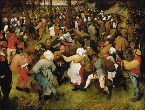
6. Pieter Bruegel the Elder, The Wedding Dance
The large canvas is a lurid swirl of Bacchanalian drinking, dancing and kissing. Somehow the men in their codpieces make the composition seem oddly sexualized too. Made at a time when most paintings were of royalty, Greek myths and Christian themes, seeing someone celebrating peasants makes Bruegel’s work all the better. The bride here does not wear white. There’s no need to be virginal, not yet in history. Instead she’s in black with red flowing hair and a doughy face, smiling at the center of the canvas. The painting is no mere revolution in subject matter, but more than that: protest and politics. Catholics had taken over Bruegel’s country, Flanders. Flemish rights were trampled, native customs outlawed. The country had turned Protestant until Catholic Spain conquered. To paint a peasant wedding celebrating the old customs was a protest in the face of political will. That alone makes it worth keeping in Detroit at this very moment.
7. Cassatt vs. Degas
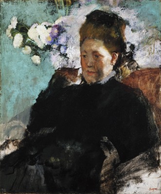
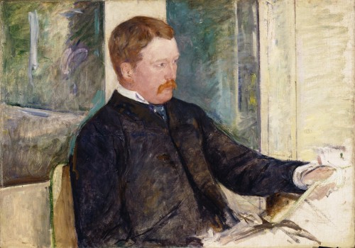
“I would rather you were dead.” This is what Mary Cassatt’s dad said about her decision to become an artist. Degas said about her etchings: “I am not willing to admit that a woman can draw that well.” And he was her friend and mentor, the one who first invited her to show with the Impressionists. His comment is just one of the reasons I say keep the Cassatts and dump the Degas. Plus, the collection has some 16 of his works to just three of hers. That American museums today have such strong collections of Impressionist work is due in part to Cassatt. She hails from a prominent family; they owned the Pennsylvania Railroad. She convinced her family and friends to buy her Parisian compatriots’ work. Degas owes a debt to Cassatt indeed.
His Portrait of a Lady is fine: with the brisk brushwork, the unfinished naked canvas around the subject and the sketched-in flowers. Compare this to Cassatt’s portrait of her brother, the railway magnate. He looks eager and rushed, and the undone right corner in his portrait suggests his haste, that he’s not quite comfortable being posed. In fact, he comes off as stiff but that’s not the fault of her painting. Rather it gives him more personality and purpose as he clutches for something perpetually undone and unmade. After her brother, her last close family member, died in 1906 her work took a more schmaltzy turn. She could have been a Henry James heroine though, and her life suggests too Edith Wharton, a woman who goes her own way, moves to France, pursues her art and finds it often in the subject of her own world. At the end of Cassatt’s life she was blinded by cataracts, but she kept working – even gave a number of her paintings to be sold for that radical cause: women’s suffrage.
8. Rembrandt’s Jesus vs. Just About Any Other Version of Christ in DIA’s Collection
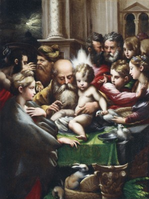
Most versions of Jesus are blond and fair skinned, pretty and suffering. (An exception here is the Master of the Holy Blood’s Ecce Homo – trans: Behold the Man– which is gruesome to look at and amazing for it). Take the baby Jesus getting his briss by Parmagianino. The babe has blond ruffled curls; there’s a cute bunny below in a basket; everyone else looks terrified of the circumcision. Rembrandt though didn’t feel a need to rewrite (or repaint) history. He lived in the Amsterdam’s Jewish neighborhood and often painted its residents as well as the city’s rich. He treated both with equal care.

Head of Christ, Attributed to Rembrandt van Rijn, c. 1648/1650, oil on oak panel. Detroit Institute of Arts
DIA’s collection is filled with many of Rembrandt’s followers, and the painting of Jesus is accompanied by that line, “attributed to,” which is the museum’s code to say the authorship is in question. Those two words mean this is possibly a copy, maybe by one of his followers, but they don’t want to say. (The National Gallery has a Vermeer with just such an “attributed.”) Regardless, this very Rembrandt here has Jesus’ head tilted, eyes up, almost pleading. It’s Jesus as common man – sad, average –human. That humanity makes the painting worth keeping, regardless of the “attributed.” In fact, the “attributed” is one good reason not to sell. Once the authorship is in question, proving it is expensive and takes years, and the “attributed” can knock down the value.
Now hold that up to the briss, a painting whose provenance lists Pope Clement VII and Emperor Charles V. Look at Mary’s weird long fingers and the priest’s too, and the nearly cartoonish faces –plus the equally comic bunny. The painting too might well have played a part in Henry VIII’s break from Rome and inability to divorce his wife Catherine (Charles’s aunt). The painting was a present from Clement, who vacillated in his allegiances between Francis I of France (pro-England) and Charles (against), to Charles the Spanish emperor. The briss was painted a couple years before Henry came looking for his legal annulment and would have been an easy gift to hand in 1527 just after the sack of Rome. Imagine the painting’s subject, the circumcision with a priest sealing the deal and anxiety as subtext for the track of European power. (Sell it).
9. Eva Hesse and the Men
Here she sits in a gallery with the masters of minimalism and post-minimalism. There’s Donald Judd and Sol Lewitt and Carl Andre (who may or may not have killed his wife Ana Mendieta. His reputation in the art world is returning, and he was acquitted. Still, many hold him responsible.). On the parquet floor is Hesse’s beautiful galvanized steel cube woven through with plastic tubing. Imagine the hours it took to lace it through the holes just a year before her death. The piece is a response to the coldness of minimalism, which took the serial object as subject. A sculpture of a steel form was not meant to be anything but the steel form. A cube was a cube, its very cube-ness the piece. Yet, her riff on minimalism’s obsession with cubes calls up Meret Oppenheim’s furry teacup, soft on the inside. Hesse’s suggests softness and violence. In 100 years, my guess is we will care most about Hesse. Such bets are for suckers. Still how can you de-accession (as selling off a museum’s collection is called) a work called Accession? Here is her Accession II, though not her second version of it. Only a few exist, while Judd’s Untitled (Stack) is far more common to see. Similar ones appear in other colors and other collections around the world.
10. Diego Rivera Detroit Industry Murals
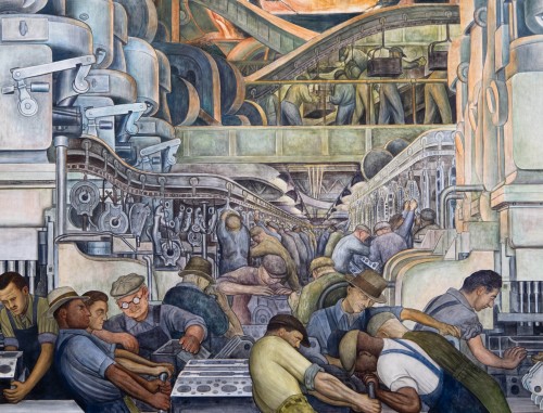
Taking us almost back to the start with the notion of industry and men’s work and haste, and that a painting is married to its context. The murals are one of his – if not Rivera’s best – work. They’re frescoes, so painted into wet plaster, meaning to sell them would destroy the building. They’re also about the Motor City itself. Funded by Edsel Ford, the murals celebrate industry at Ford’s River Rouge Plant, where a month before Rivera started, a strike organized by the Communist Party (the unions at that point had no power and no contracts) left four workers dead. The panels go from a baby to hulking factory scenes valorizing the working man. Though on the west wall, a manager is painted with the same grace as a laborer as if both were equal. And, at the top of the north and south walls surreal, disembodied fists clench rocks. When the police and Ford’s security shot at the peaceful protesters, they picked up only weapon to hand: stone.
The mural caused a big brouhaha when it was launched. Local leaders called it un-Christian. Come the 1950s and McCarthyism, Rivera’s Marxism nearly led to the murals’ destruction. The only thing that saved them was a sign by their entrance:
“Rivera’s politics and his publicity seeking are detestable. But let’s get the record straight on what he did here. He came from Mexico to Detroit, thought our mass production industries and our technology wonderful and very exciting, painted them as one of the great achievements of the twentieth century. This came after the debunking twenties when our artists and writers found nothing worthwhile in America and worst of all in America was the Middle West. Rivera saw and painted the significance of Detroit as a world city. If we are proud of this city’s achievements, we should be proud of these paintings and not lose our heads over what Rivera is doing in Mexico today.”
Indeed let’s not lose our heads… And, remember the stone and fists.

Detroit Industry, west wall (detail) worker with red star on glove. Diego Rivera, 1932-33, fresco. Detroit Institute of Arts

